Educa UNIVERSITY|ART AND ARCHITECTURE

Letter typology: What are they and how do they affect your life?
Related Masters


Letter typology: What are they and how do they affect your life?
Hello, I'm Carlos Hidalgo and today I'm going to talk to you about a topic that makes a difference in more ways than you might imagine: letter typology. Throughout my professional life, I have had to deal with a wide range of typefaces in design projects, marketing, and even in my day-to-day writing of documents. Maybe you don't know it, but the typeface you choose can communicate more than you think. From the formality of a serif font to the modernity of a sans serif, everything counts. If you don't believe me, join me on this journey through the exciting world of typefaces.
What is letter typology?
When we talk about letter typology, we refer to the study and classification of the different styles of letters or typefaces that we use to write. These typefaces not only have an aesthetic function, but they communicate sensations and can affect how we perceive the content. It is not the same to read a report written in Times New Roman than in Comic Sans, right? Both have completely different purposes.
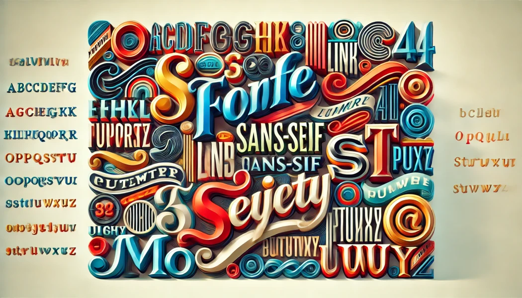
The serif fonts are those that include small finials at the ends of the letters. For example, Times New Roman or Garamond are classics in editorial design for their legibility and formality. On the other hand, sans serif, such as Arial or Helvetica, dispense with these finials, offering a more modern and cleaner appearance.
The best-known typefaces
Over the years, certain typefaces have emerged that have left their mark on the history of graphic design. Here I tell you about some of the most influential:
- Times New Roman (1932): This font was designed for The Times newspaper in London, improving both legibility and space efficiency.
- Helvetica (1957): Considered by many to be the Queen of sans serif fonts, this typeface is beloved for its versatility and clean appearance. It has been used on everything from subway signage to major brand logos.
- Clarendon (1842): Although you might associate it with wanted posters from the old West, this decorative font has modern applications in advertising.
Why is the choice of typeface important?
Here's where the thing gets interesting. Choosing the right typeface is crucial not only to communicate the right message, but also to do so effectively. A poorly chosen font can be a disaster for readability, and I assure you that I have experienced this firsthand. I've worked on projects where changing the typography was what we needed for the message to finally connect with the audience.
For example, serif typefaces like Times New Roman work perfectly on more serious projects, such as academic papers or reports. But if you're designing a modern website or mobile app, you're more likely to want to opt for a sans serif like Arial or Lato, which offer a more minimalist, cleaner feel.
Typefaces beyond paper
It's not just about writing, friend. Typography is also critical in digital design. On websites or applications, the choice of font affects the user experience. It is not only about aesthetics, but also about usability. Heavily ornamented fonts can look attractive, but be a headache in digital interfaces, where clarity and legibility are key.
Even in something as intimate as a tattoo, the choice of typeface speaks for itself. Want your tattoo to have a more mysterious feel? Then a gothic font may be the one. Something more personal and fluid? Opt for script style calligraphies that feel like handwritten.
Technological evolution of typography
You'd be surprised how typography has evolved over time. The invention of the mobile type printing press by Gutenberg revolutionized the world of lettering. However, the digital era has democratized its access, allowing anyone to experiment with typography without the need for expensive tools.
How to use typefaces to your advantage
After years fighting with documents, design projects and even marketing collaborations, I can tell you one thing: knowing how to choose a suitable typeface can elevate your project. Here are some key tips for you to achieve it:
- Identify your target: If it's a formal text, don't risk with flashy fonts. Use serif to communicate seriousness and professionalism.
- Test several fonts: Readability is key. If it's for web, do several tests with sans serif typefaces to see which works best.
- Adjust line spacing and letter spacing: It's not just the font, it's how you present it. Increasing the spacing between letters can do wonders for legibility.
- Beware of extremes: Overly decorative fonts can attract attention, but not always for the best. Don't get too creative.
Conclusion
In the end, typography is not a mere detail, it is a powerful visual communication tool. Whether you're designing a logo, writing a report, or even choosing a tattoo, the letters you use matter, and a lot.
Remember that the right choice will not only make your work more appealing, but will also communicate the message with the precision and impact you desire.
Faculties
Trainings
The faculties embrace diverse academic disciplines and fields of study, opening doors to new perspectives and exploring different spheres of wisdom in a constantly evolving world.

